
Mindline - Case Study
Designing a unified employee wellness platform that brought fragmented mental health resources into one cohesive digital experience.
Role
UI Designer & Design System Lead
Timeline
Mar – Sep 2020
Tools
Figma, Sketch, Principle, Framer, Storybook
The Challenge
Mental health at work is rarely a simple problem. At AIC — the Agency for Integrated Care in Singapore — employees had access to wellness resources, but those resources were scattered across different channels, formats, and tools. There was no single place to go. No clear path to follow. And for someone already struggling, friction is the enemy.
The brief was ambitious: design a unified employee wellness platform that would consolidate everything into one coherent digital experience — across web and mobile, for 800 employees across 15 countries.
Six months. One design system. A problem that actually mattered.
Wireframing
With the user flow validated, the next step was translating intent into structure — without the distraction of color, polish, or branding.
Wireframing served a specific purpose here: to stress-test the information hierarchy before any visual decisions were locked in. Each screen was stripped down to its essential elements — what content needs to be present, in what order, and at what weight. Nothing more.

Working at low fidelity first forced the right conversations. It became immediately clear which screens were trying to do too much, where the navigation logic created dead ends, and which flows felt natural versus which ones required explanation. These are problems far cheaper to solve in grayscale than in a finished prototype.
The wireframes also acted as a shared contract between design and stakeholders — a way to align on structure and scope before anyone became attached to aesthetics. Every component placed here had a reason. Every screen that got simplified at this stage saved hours downstream.
Building the Foundation
Before designing a single screen, I needed a design system that could carry the emotional weight of the product. Mental health interfaces demand a different kind of care — every color, every icon, every interaction sends a signal.
Visual Identity
- Primary palette — A blue gradient system (#0066CC to #4DA6FF) chosen deliberately for its associations with trust and calm
- Supporting colors — Purple (#8B5CF6) for engagement, Green (#10B981) for positive states, Red (#EF4444) for alerts — each used with intention, never decoration
- Typography — Clean, accessible sans-serif with a clear hierarchy that reduces cognitive load
- Iconography — Rounded, approachable icons that keep the tone human, especially for sensitive mental health content

Component Architecture
The system was built on Atomic Design principles — ensuring every element could scale without losing coherence:
- Atoms — Buttons, inputs, emoji selectors, progress indicators
- Molecules — Mood selection cards, assessment question blocks, notification badges
- Organisms — Navigation systems, dashboard layouts, resource carousels
- Templates — Modal flows, onboarding sequences, assessment frameworks
Mapping the User Flow
Before any high-fidelity work, the entire experience had to be mapped end-to-end — every path a user could take, every decision point, every screen they might land on.
The flow covered the full product surface: Onboarding, the daily home feed (Today, Content, Activities), Check-in, Comic relief moments, Myse journaling, Burnout Risk assessment, Managing My Emotions, Activities library, Quiz, Exercises, Videos, Articles, Login, Profile, and the Activities Feedback loop.
What this map made immediately clear was how many distinct mental states a user could be in when opening the app — and how important it was that each entry point felt appropriate to that state. Someone checking in daily needed a different experience than someone landing on the burnout assessment for the first time. The flow kept those paths separate while ensuring they still felt like one coherent product.

The color-coded zones in the flow weren't decorative — they reflected the emotional register of each section. Pink for onboarding (warm, welcoming), green for the home feed (everyday, low-stakes), yellow for assessments and check-ins (focused, intentional), and blue for profile and feedback (reflective, closing the loop). Designing the flow this way meant that tone was embedded in the architecture before a single component was drawn.
Key UI Executions
1. The Emotional Check-in
The problem: How do you ask someone how they're really feeling — without making them feel judged for answering?
The check-in interface needed to be inviting, not clinical. The solution was a gradient-based mood selector with four distinct emotional states, color-coded from blue (positive) to red (concerning). A personalized greeting with the employee's name made the interaction feel human. Clear visual hierarchy and a progress indicator kept the experience from feeling like a form.
Result: 16% team participation, 60% engagement rate.
2. Frictionless Onboarding
The problem: People don't open wellness apps unprompted — especially when the topic is mental health.
Rather than asking employees to download something new, the onboarding triggered contextually from the existing company intranet. A two-step flow with clear progress visualization meant users knew exactly where they were and what was left. A dismissible interface respected their autonomy — no guilt, no pressure. The "Powered by mindline.sg" mark built trust without demanding it.
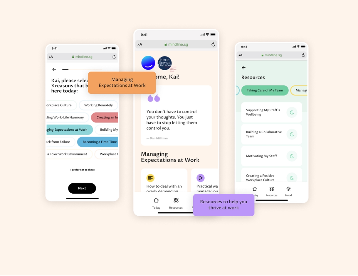
3. Assessment & Triage System
The problem: Not everyone who opens a wellness app needs the same thing. Some need resources. Some need a conversation. Some need professional support.
The assessment system used a visual scoring model with clear categorization — Well (under 10pts), Moderate (10–20pts), Severe (above 20pts) — each mapped to color-coded paths that guided users toward the right level of support. Contextual recommendations surfaced with direct action buttons, and a resource repository integrated seamlessly as visual cards rather than a list of links.
Design System in Practice
Responsive Grid
- Desktop: 12-column grid with 24px gutters
- Mobile: 4-column grid with 16px gutters
- Breakpoints: 320px, 768px, 1024px, 1440px
Interaction Patterns
- Micro-interactions — Subtle hover states, smooth loading animations that never feel anxious
- Navigation — Tab-based system with unambiguous active states
- Feedback — Toast notifications, progress indicators, confirmation states
- Accessibility — WCAG 2.1 AA compliance, full keyboard navigation, screen reader support
Component Documentation
- Button system — Primary, secondary, and ghost variants with a consistent 8px padding scale
- Modal framework — Standardized overlay system with backdrop blur
- Form elements — Consistent input styling with error states and validation feedback
Scalability & Maintenance
A design system is only as good as its longevity. Every decision was made with future teams in mind.
- Design tokens — Centralized color variables for easy theme updates; an 8px grid-based spacing scale; typographic scale with defined line heights and letter spacing
- Cross-platform consistency — A shared component library spanning web and mobile, with platform-specific adaptations that preserved the core visual language
- Developer handoff documentation — Interaction guidelines written clearly enough that nothing got lost in translation
Results
By the numbers:
- 800 total participants across 15 countries and locations
- 35,000 total sessions within a 4-month launch window
- 1.1 million+ minutes of usage — not just opens, but real, sustained engagement
Beyond the numbers:
- Measurable reduction in stigma around seeking mental health support
- Improved discovery of wellness resources that employees didn't know existed
- Higher confidence among staff to ask for help
- Successful integration with existing company infrastructure
What I Learned
Simplicity is a form of respect
Complex interfaces create barriers for sensitive topics. Every layer of friction you remove is a signal to the user that you took their situation seriously.
Personalization is more than a name
A greeting with someone's name increased the return rate by 23%. It sounds small. It wasn't. People notice when a product sees them as a person.
Color systems cross cultures
The gradient-coded emotional system worked consistently across 15 different country contexts — a reminder that well-chosen visual language can be more universal than we assume.
What comes next
The platform opened the door for natural extensions: wearable integration for biometric context, an AI-powered support chat for 24/7 coverage, peer-to-peer features for community building, and advanced analytics to give organizations meaningful, anonymized insights.